Alberto Burri
graphic works - 1959-1977
Text by Vittorio Rubiu
Nn 1959, when he began his activity as a real engraver, Burri actually continued intentions similar to those carried out in painting, but, of this, he naturally chooses those sides that lend themselves to a technique that lies between engraving and chalcography . Thus the first Combustion of the Castelli Edition (1959) is performed in mixed media and the impression it makes is very similar to that of direct combustion. Indeed, as the technique is refined, this impression may lead to almost an indistinction, so much perfected is the recovery of the effects of burning and relief.
Not unlike the Muffa (also from 1959), although reduced to black and white; and where the small, wandering black marks, a kind of enlarged comma bacilli, give a particular inconsistency to the paper plane of the incision.
Then, in 1962, the three etchings and aquatint appear, which are made for the volume by Emilio Villa Variazioni, published by the Origine Foundation and printed by 2RC. Of these three engravings, one was the cover and the other two were inserted in the text. Needless to say, they weren't illustrations. Here the reappearance of very thin, thin and hard filiform signs, which almost seemed, like electric wires, to have to shoot sparks when they cross each other, clearly reflects the particular aggressiveness that Burri's work always contains.
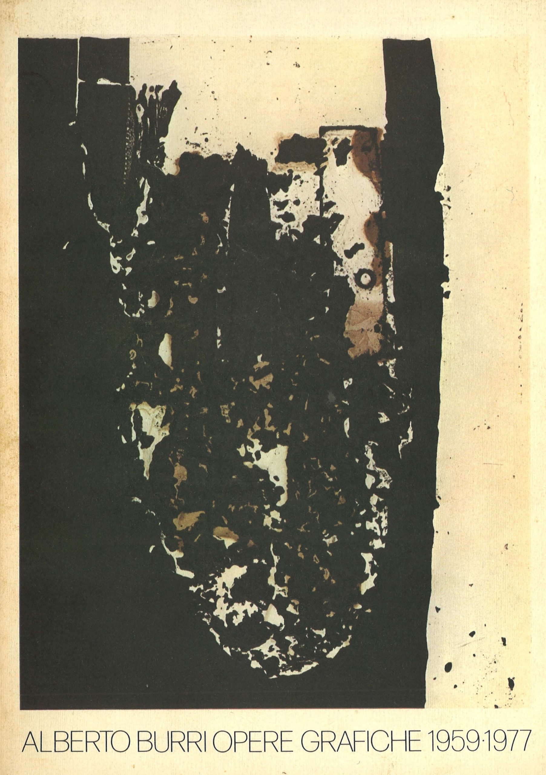
There followed, in 1963-64, a Combustion (2RC), also with etching and aquatint, but in which the aquatint manages to reproduce in an amazing way the paper lapped by the fire, that intermediate stage between the flaming paper and the burnt paper. , which would seem impossible to obtain other than with the flame.
After this Combustion it was the turn, in 1965, of a folder of six Combustions still in etching and aquatint, in which the fragmentation of the burnt paper suggests a sort of suspension in space, which here and there the yellowish halo of the flaming paper corroborates with a sinister nocturnal glow.
In 1967-68 is composed the folder of Sei Bianchi e Neri I, made with an elaborate technique of lithography, chalcography and acetate collage (2RC), which naturally reflect a similar moment in painting, yet manage to have their own graphic independence from to the paintings. It was this series that also attracted the attention of the Accademia dei Lincei and earned Burri the Feltrinelli Prize for graphics in 1972.
For a volume of Homage to Ungaretti Burri in 1969 he created a Combustion in etching and aquatint (2RC), like a strange imprint left in the stone by something prehistoric.
To the same year 1969 belongs a folder of six plates made in screen printing and completely different from the previous graphics. They are called Letters and there are colors to which the best known painting (but not certain tempera between the late forties and early fifties) had been foreign, apart from red: here is yellow, blue. , grays, as well as black and white: but some thin and very hard lines connect the Letters to the Variations of Villa's book (as well as to the pen drawings executed in large numbers before the engravings).
Also in '69 another folder appears, Bianchi e Neri Il, of six plates in lithography, chalcography and acetate collage, in which the shapes are elementary without being geometric and yet even more naked and peremptory, up to the black point and the very slight almost imperceptible chromatic variation that produces transparent and colorless plastic
(acetate) on the white background. Furthermore, the white edge of the sheet is as if it distances and isolates the engraving not only from what may be contiguous, but in a space that is more theoretical than real, such as that of non-Euclidean geometries.
Also of the type described above is a large lithograph-intaglio (1970) entitled Nero (133 x 99 cm), which in this case almost reaches the proportions of the paintings in the series.
Meanwhile in painting Burri had taken up on a much larger scale the motif of the cretti, already made a first time with the All white exhibited at the Venice Biennale of '58. Thus was born the series of Cretti where the cracks or cracks, with varying rhythm and depth, affect part of the surface, or the whole surface. Also in the engraving Burri creates a series of eight large Cretti (up to one meter), either all white or all black, with no margin. They are the engravings closest to painting, almost to be exchanged with it (1971).
This series is followed, between 1971 and 1972, by four lithographs -calcographs with acetate collages (all, like the previous ones, published by 2RC): and respectively Nero (1971), Grande Bianco e Nero and Grande Bianco (1971) , Graphic Presence (1972).
Speaking of Burri's graphics, some color serigraphs have been listed: these derive from a series of small tempera colors, which Burri had begun to paint many years earlier, later resumed, then continued until today, mostly in function of the silk-screen production. . This series of tempera represent a parallel path with little or no interference with the pictorial activity carried out, one would say, in capital letters. The attack with a tradition is difficult to find, because, although they are strictly abstract works, they do not necessarily relate to any consecrated strand of abstractionism. In reality, the Burri of these temperas is like in free release and discovers colors, previously eliminated, pure, bright colors, contrasting but not complementary, simple forms that intertwine as in a kaleidoscope, often with a grace to which the "terrible Of the most universally known Burri had certainly not accustomed us.